Monday, 9 November 2015
Sunday, 8 November 2015
21 - Double Page Spread Developments/Progress

This was the original image for my double page spread, before I edited it.

I then altered the lighting of the photo, and also photo shopped the hat and jogger's logo.

I then created the first version of my double page spread, by adding my own page next to the photo, to create a double page. I then added my own text. I decided on black, white and red for my colour scheme, for all the way throughout my magazine, as it gives a dangerous look. I created the feature story for my main feature story, so that the page would look as interesting as possible. I then linked the main story with the main image.

This is now my finished product. I added a dropcap. I changed the positioning for most of the text and changed the main feature story a little, so that it is now in the middle of the page, obvious to the reader that it is the main feature story.
Saturday, 7 November 2015
20 - Contents Page Developments/Progress

This was the original image for my contents page, before I edited it.

I then cropped the sides of the image and also changed the filter to 'posterize', to give more of cartoon-like image.

I then put the image on one side of the page, so that i had the other side on the page for my text. I added the feature stories in the same font and colour that they were on my front cover, still following the colour scheme of black, white and red, as it gives a dangerous look, but also adding grey to my colour scheme and then leaving the image with it's original colours, as it also gives soft-like look.. I added another photo of the duo that is on the main image on my front cover for my contents page, and also made the main feature about the main image too, making sure that it stands out more than all the other feature stories. I also added the masthead from my front cover onto the contents page.
 This is now my finished product. I made the main image a lot smaller, yet kept it on the same side of the page.I changed the feature stories a bit so that the page numbers are now on the opposite side as they were before. I created a 'reviews' section and also a 'subscribe' section. This now looks much more professional than before, therefore my magazine would now have a much better chance in being bought and read.

Friday, 6 November 2015
19 - Front Cover Developments/Progress

This was the original image for my front cover, before I edited it.

I then changed the filter to black and white and also photo shopped the tank top, the hat and the hoodie's logo.

I then created the first version of my front cover by adding my own text and barcode. I decided on black, white and red for my colour scheme, as it gives a dangerous look. I added other rappers for the feature stories to make the front cover look as interesting as possible. I then linked the main story with the main image.

This is then my second version of my front cover. I added a plug and also descriptions for each feature story. I changed the positioning for most of the text and changed the main feature story a little, so that it is now in the middle of the page, obvious that it is the main feature story.
 This is now my finished product.I slightly changed the position of the plug and also changed the font colour. I added a header and footer on my front cover and then put different artists' names on them. I put an outline on the magazine title and also main feature story title, so that this would make it obvious for the reader to acknowledge the magazine's name and also know that the feature story is the main one.I also changed the positions of the feature stories too, so that they weren't all spread along the page, this then makes the main image for noticeable to see.

Thursday, 5 November 2015
Existing Magazines
Existing Magazines
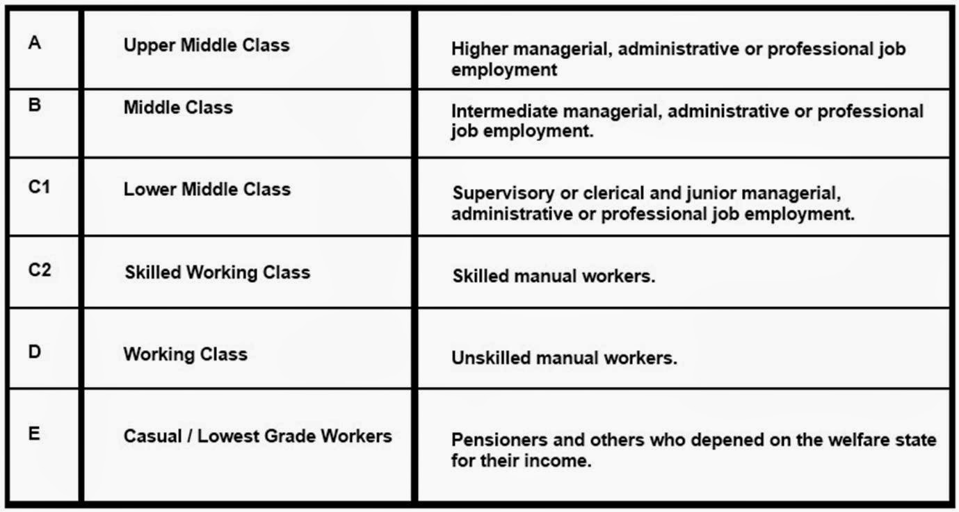
It is
important for institutions to understand the demographic of their reader, as
this makes sure that the magazine is suitable for the reader. This impacts on
the choices the institutions make in relation to their product, as for example
if the magazine readers were upper middle class then the magazine would be very
professional and the cost would be high, the language would also be higher and
there would be more text too. The quality of the magazine is also better, and
the free gifts are of a higher quality too. The advertisements would be
suitable to a high class. If the
magazine readers were casual workers then the magazine wouldn’t be very
professional and the cost would be a lot lower too, the language would be quite
simple and there would be more pictures than text. The quality of the magazine
isn’t as good, and the free gifts are quite low quality too. The advertisements
would be suitable to a lower class.

I can tell that this magazine is upper middle class, as the
masthead is quite fancy. The main image is also wearing a suit. The magazine is made from good quality materials, and the price is also quite high. The font is quite simple, yet is shows high class.

I can tell that this magazine is middle class, as the main image doesn't look very smart, yet it still looks quite professional. The price is
quite high, yet the quality isn’t as good as upper middle class.


I can tell that this magazine is lower middle class, as the main image is wearing casual clothing, and also looks quite plain. The masthead is bright and bold, which makes it appeal to a particular target audience. The free gift also shows how the magazine is lower middle class, because of the 7 posters. The material would also be cheaper paper too.

I can tell that this magazine is skilled working class, as the main image is wearing working clothes. The background is country, which implied it is also most of the reader's workplace, as the magazine is about country music.

I can tell that this magazine is working class, as the font is all the same, and blocked, which is very simple. The main image also isn't very professional looking. The price is quite cheap, and the material used is also of quite low quality.

Magazines

I have chosen a variety of XXL magazines, to compare the mise en scene of each one. The set out is very similar for each front cover, as the masthead is always in the same place and most of the feature stories are also in the same place too. Each pose is different though, and also the props and lighting are too.
Wednesday, 4 November 2015
Font Ideas for my Magazine
Font Ideas for my Magazine


I have chosen these fonts because i think they look the best. They fit into the theme of rap, and greatly stand out. The fonts with arrows and blocks like flats resemble the urban streets. The fonts with the flicks resemble kind of mafia font, which also fits in with rappers. The 'NEW MOTOR' font is very effective, because the font looks like tires, which resembles cars. The different colours for the different fonts are also effective too, as they all suit each other and match.
Music Magazine Questions and Focus Groups
Music Magazine Questions
1.
What genre of music do you
listen to the most?
Pop
HipHop
House
reggae
2.
What music artist would
you like to see on the front cover?
An influencal artist such
as Beyoncé
Snoop Dogg
Skrillex
Nineties boy
3.
What type of article would
you like to read about your favourite music artist?
An exclusive story about
the artist that nobody else knows
Personal information on the artists
What was their life like in the past before they became famous
How nineties boy became
famous
4.
What is your favourite
colour scheme?
Red, Black and White
Purple and Yellow
Red, black and white
Green black
5.
How much would you pay for
a music magazine?
£2.99
£2.50
£2.50
$1.89
6.
Would you prefer a
magazine to be made from thin or thick paper?
Thick
Thin
Juicy
Thick
7.
What types of adverts
would you like to see in a music magazine?
Upcoming
festivals/concerts
New singles/albums available for purchase
New singles/albums
Free songs
8.
What would you like the
free gift to be?
Music off iTunes ect.
Poster
Discounts
Signed cd
9.
Do you prefer formal or
informal music magazines?
Informal
Informal
Informal
Formal
10.
What kind of shops would
you buy a music magazine from?
Popular shops such as
Topshop/Zara ect.
HMV
Any
Carols

Focus Groups

Tuesday, 3 November 2015
18 - Image Manipulation

This is the main image for my front cover.
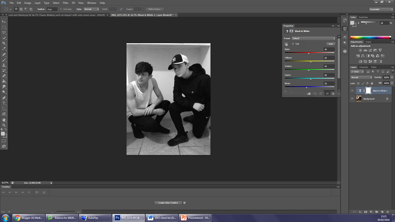
Firstly, I changed the filter to black and white.

I then photo shopped the vest, hat and hoodie's logo to red.

I then added a bar code.

Then I added the masthead.

Then, I added the plug.

I then added the name of the main feature story, which is also the name of the band in the main image.

I then added the name of the main feature story.

I also gave a description of the main feature story, to let the readers know that it is the main feature story.

I then started to add the feature stories in, giving them descriptions underneath each one.


I then finally added the text within the plug.

This is the main image for my contents page. I saved all the text for my contents page as a separate image, and then added it to my main image.

Firstly, I edited the photo to give it a cartoon-like look to it.

I then changed the white background to grey.

I then added my masthead, which is completely the same as the one from my front cover.

I then added the heading.

I then added the sub heading.

Then I added the main story, yet didn't change the name of the main feature story at that point.

I then added all of the other feature stories.


I eventually added all of my feature stories onto the contents page.

Lastly, I then changed the name of the main feature story, so that it links in with the main image which the article is about. I then edited the main image a little more, and also added a page number.

This is the main image for my double page spread.

Firstly, I photo shopped the colour of the hat and the joggers logo to a red colour.

I then changed the right side page to a grey colour.

I then added in my magazine logo and also the page numbers to the bottom left and right corners of both pages.

I then added the name of the duo which my article is about, which is also the main image.

I then added the title of my article, which also relates to the name of the duo and also the main image.

I then cropped the double page spread out from Photoshop and saved it as an image. I then opened it up onto publisher and then added in my text. I also added in the pull quote and the stand-first, making sure that the pull quote matched with the name and title. I also made the stand-first into the same font, size and colour as the rest of them text, but made sure it was in a different position as the rest of the text.
Subscribe to:
Posts (Atom)