This is the main image for my front cover.
Firstly, I changed the filter to black and white.
I then photo shopped the vest, hat and hoodie's logo to red.
I then added a bar code.
Then I added the masthead.
Then, I added the plug.
I then added the name of the main feature story, which is also the name of the band in the main image.
I then added the name of the main feature story.
I also gave a description of the main feature story, to let the readers know that it is the main feature story.
I then started to add the feature stories in, giving them descriptions underneath each one.
I then finally added the text within the plug.
This is the main image for my contents page. I saved all the text for my contents page as a separate image, and then added it to my main image.
Firstly, I edited the photo to give it a cartoon-like look to it.
I then changed the white background to grey.
I then added my masthead, which is completely the same as the one from my front cover.
I then added the heading.
I then added the sub heading.
Then I added the main story, yet didn't change the name of the main feature story at that point.
I then added all of the other feature stories.
I eventually added all of my feature stories onto the contents page.
Lastly, I then changed the name of the main feature story, so that it links in with the main image which the article is about. I then edited the main image a little more, and also added a page number.
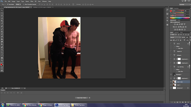
This is the main image for my double page spread.
Firstly, I photo shopped the colour of the hat and the joggers logo to a red colour.
I then changed the right side page to a grey colour.
I then added in my magazine logo and also the page numbers to the bottom left and right corners of both pages.
I then added the name of the duo which my article is about, which is also the main image.
I then added the title of my article, which also relates to the name of the duo and also the main image.
I then cropped the double page spread out from Photoshop and saved it as an image. I then opened it up onto publisher and then added in my text. I also added in the pull quote and the stand-first, making sure that the pull quote matched with the name and title. I also made the stand-first into the same font, size and colour as the rest of them text, but made sure it was in a different position as the rest of the text.


No comments:
Post a Comment