Existing Magazines
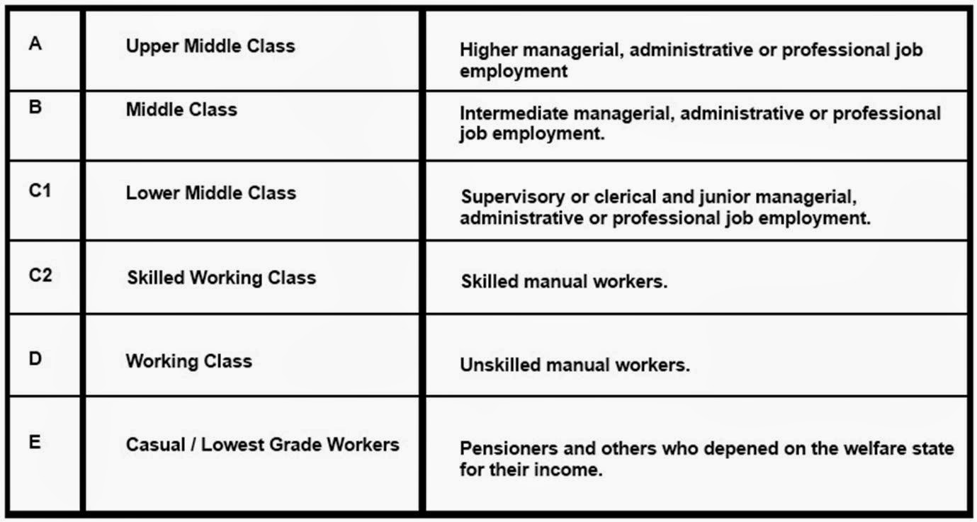
It is
important for institutions to understand the demographic of their reader, as
this makes sure that the magazine is suitable for the reader. This impacts on
the choices the institutions make in relation to their product, as for example
if the magazine readers were upper middle class then the magazine would be very
professional and the cost would be high, the language would also be higher and
there would be more text too. The quality of the magazine is also better, and
the free gifts are of a higher quality too. The advertisements would be
suitable to a high class. If the
magazine readers were casual workers then the magazine wouldn’t be very
professional and the cost would be a lot lower too, the language would be quite
simple and there would be more pictures than text. The quality of the magazine
isn’t as good, and the free gifts are quite low quality too. The advertisements
would be suitable to a lower class.

I can tell that this magazine is upper middle class, as the
masthead is quite fancy. The main image is also wearing a suit. The magazine is made from good quality materials, and the price is also quite high. The font is quite simple, yet is shows high class.

I can tell that this magazine is middle class, as the main image doesn't look very smart, yet it still looks quite professional. The price is
quite high, yet the quality isn’t as good as upper middle class.


I can tell that this magazine is lower middle class, as the main image is wearing casual clothing, and also looks quite plain. The masthead is bright and bold, which makes it appeal to a particular target audience. The free gift also shows how the magazine is lower middle class, because of the 7 posters. The material would also be cheaper paper too.

I can tell that this magazine is skilled working class, as the main image is wearing working clothes. The background is country, which implied it is also most of the reader's workplace, as the magazine is about country music.

I can tell that this magazine is working class, as the font is all the same, and blocked, which is very simple. The main image also isn't very professional looking. The price is quite cheap, and the material used is also of quite low quality.

No comments:
Post a Comment