The media institution that I would want
distributing my media product would be Townsquare Media. The reason for this is
that XXL Magazine use them as their publisher, which is definitely a magazine
that my target audience would read. Townsquare Magazine is the third largest
AM/FM operator in America, it owns over 310 radio stations in 66 markets, so
therefore by using them I would definitely know that they will be doing a good
job. As Townsquare Magazine is such a big and well known company in America,
this would then mean that it would be easier and cheaper to advertise, as there
would be so many options.
Thursday, 21 April 2016


Monday, 9 November 2015
Sunday, 8 November 2015
21 - Double Page Spread Developments/Progress

This was the original image for my double page spread, before I edited it.

I then altered the lighting of the photo, and also photo shopped the hat and jogger's logo.

I then created the first version of my double page spread, by adding my own page next to the photo, to create a double page. I then added my own text. I decided on black, white and red for my colour scheme, for all the way throughout my magazine, as it gives a dangerous look. I created the feature story for my main feature story, so that the page would look as interesting as possible. I then linked the main story with the main image.

This is now my finished product. I added a dropcap. I changed the positioning for most of the text and changed the main feature story a little, so that it is now in the middle of the page, obvious to the reader that it is the main feature story.
Saturday, 7 November 2015
20 - Contents Page Developments/Progress

This was the original image for my contents page, before I edited it.

I then cropped the sides of the image and also changed the filter to 'posterize', to give more of cartoon-like image.

I then put the image on one side of the page, so that i had the other side on the page for my text. I added the feature stories in the same font and colour that they were on my front cover, still following the colour scheme of black, white and red, as it gives a dangerous look, but also adding grey to my colour scheme and then leaving the image with it's original colours, as it also gives soft-like look.. I added another photo of the duo that is on the main image on my front cover for my contents page, and also made the main feature about the main image too, making sure that it stands out more than all the other feature stories. I also added the masthead from my front cover onto the contents page.
 This is now my finished product. I made the main image a lot smaller, yet kept it on the same side of the page.I changed the feature stories a bit so that the page numbers are now on the opposite side as they were before. I created a 'reviews' section and also a 'subscribe' section. This now looks much more professional than before, therefore my magazine would now have a much better chance in being bought and read.

Friday, 6 November 2015
19 - Front Cover Developments/Progress

This was the original image for my front cover, before I edited it.

I then changed the filter to black and white and also photo shopped the tank top, the hat and the hoodie's logo.

I then created the first version of my front cover by adding my own text and barcode. I decided on black, white and red for my colour scheme, as it gives a dangerous look. I added other rappers for the feature stories to make the front cover look as interesting as possible. I then linked the main story with the main image.

This is then my second version of my front cover. I added a plug and also descriptions for each feature story. I changed the positioning for most of the text and changed the main feature story a little, so that it is now in the middle of the page, obvious that it is the main feature story.
 This is now my finished product.I slightly changed the position of the plug and also changed the font colour. I added a header and footer on my front cover and then put different artists' names on them. I put an outline on the magazine title and also main feature story title, so that this would make it obvious for the reader to acknowledge the magazine's name and also know that the feature story is the main one.I also changed the positions of the feature stories too, so that they weren't all spread along the page, this then makes the main image for noticeable to see.

Thursday, 5 November 2015
Existing Magazines
Existing Magazines
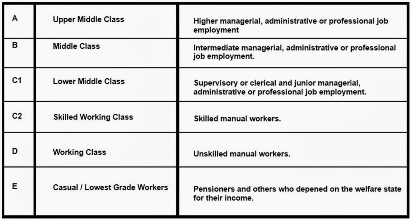
It is
important for institutions to understand the demographic of their reader, as
this makes sure that the magazine is suitable for the reader. This impacts on
the choices the institutions make in relation to their product, as for example
if the magazine readers were upper middle class then the magazine would be very
professional and the cost would be high, the language would also be higher and
there would be more text too. The quality of the magazine is also better, and
the free gifts are of a higher quality too. The advertisements would be
suitable to a high class. If the
magazine readers were casual workers then the magazine wouldn’t be very
professional and the cost would be a lot lower too, the language would be quite
simple and there would be more pictures than text. The quality of the magazine
isn’t as good, and the free gifts are quite low quality too. The advertisements
would be suitable to a lower class.

I can tell that this magazine is upper middle class, as the
masthead is quite fancy. The main image is also wearing a suit. The magazine is made from good quality materials, and the price is also quite high. The font is quite simple, yet is shows high class.

I can tell that this magazine is middle class, as the main image doesn't look very smart, yet it still looks quite professional. The price is
quite high, yet the quality isn’t as good as upper middle class.


I can tell that this magazine is lower middle class, as the main image is wearing casual clothing, and also looks quite plain. The masthead is bright and bold, which makes it appeal to a particular target audience. The free gift also shows how the magazine is lower middle class, because of the 7 posters. The material would also be cheaper paper too.

I can tell that this magazine is skilled working class, as the main image is wearing working clothes. The background is country, which implied it is also most of the reader's workplace, as the magazine is about country music.

I can tell that this magazine is working class, as the font is all the same, and blocked, which is very simple. The main image also isn't very professional looking. The price is quite cheap, and the material used is also of quite low quality.

Subscribe to:
Posts (Atom)